Cube PCs
Branding / Print / Digital
Cube specialises in building custom gaming PCs and have been established in the industry for over 20 years. They decided that their branding needed a refresh to better reflect their status and the premium nature of their products. I was asked to create the new branding and assets, as well as the new website.
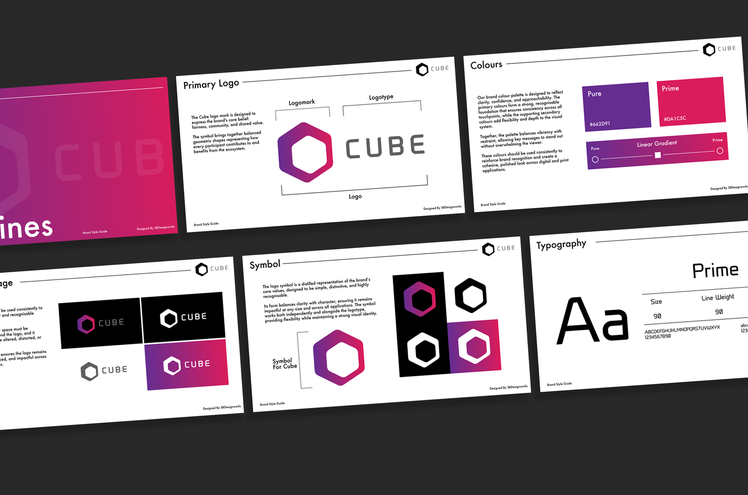
Cube Brand Guidelines
After discussing a number of potential options, the above logo was chosen as their new brand logo. It was said that it perfectly capured the brand’s ethos and message, and that it would be adaptable across a range of platforms.
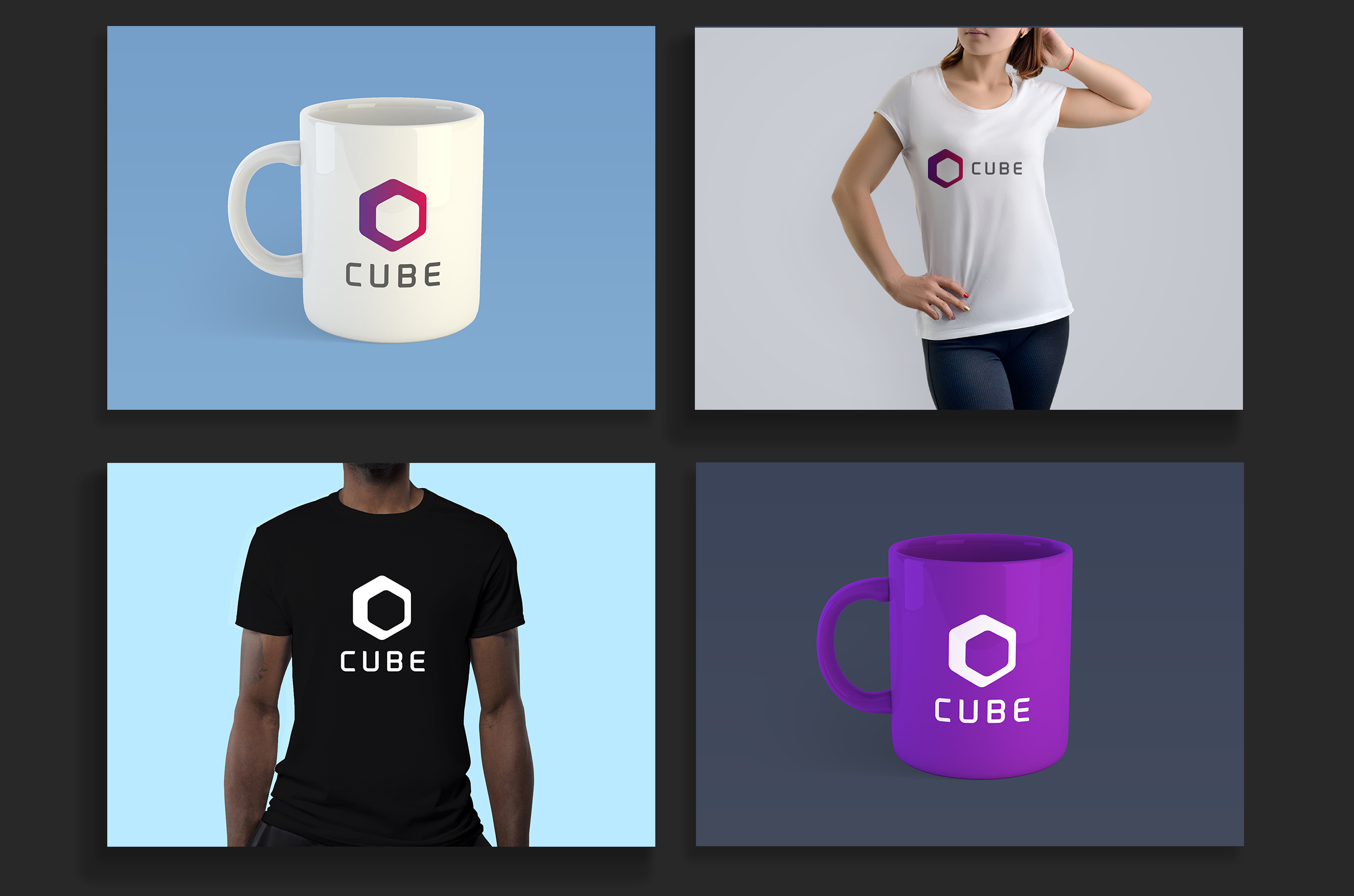
Cube Logo Applications
Once the Cube logo was finalised, I decided to see how it would look in a number of items such as clothing and accessories. This was done with a view to the potential expansion of the brand on things such as staff clothing and more.
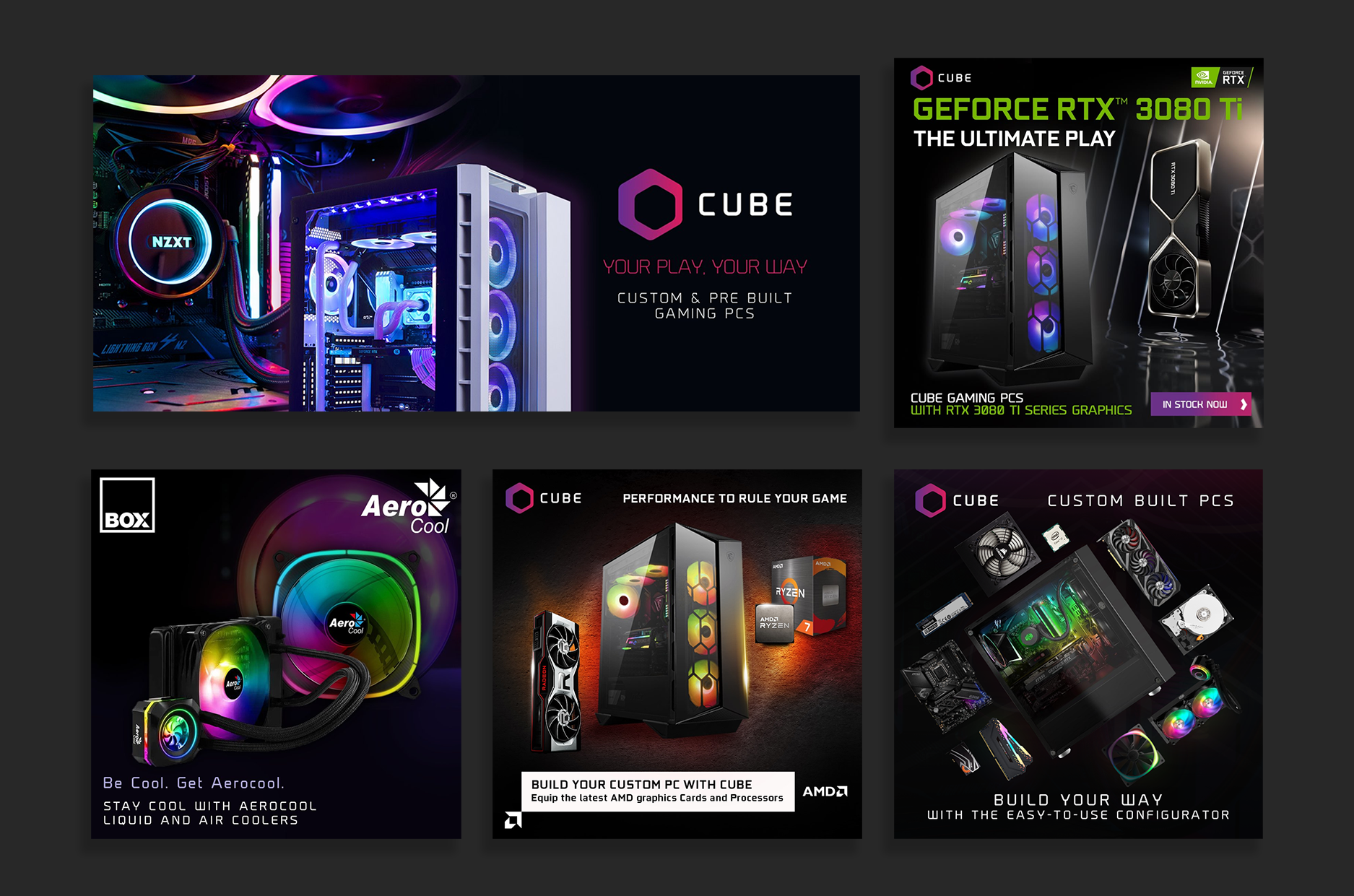
Cube Social Graphics
I then went on to create their new social graphics which were dark in nature, with the intention of helping the logo and the products stand out and remain the focus.
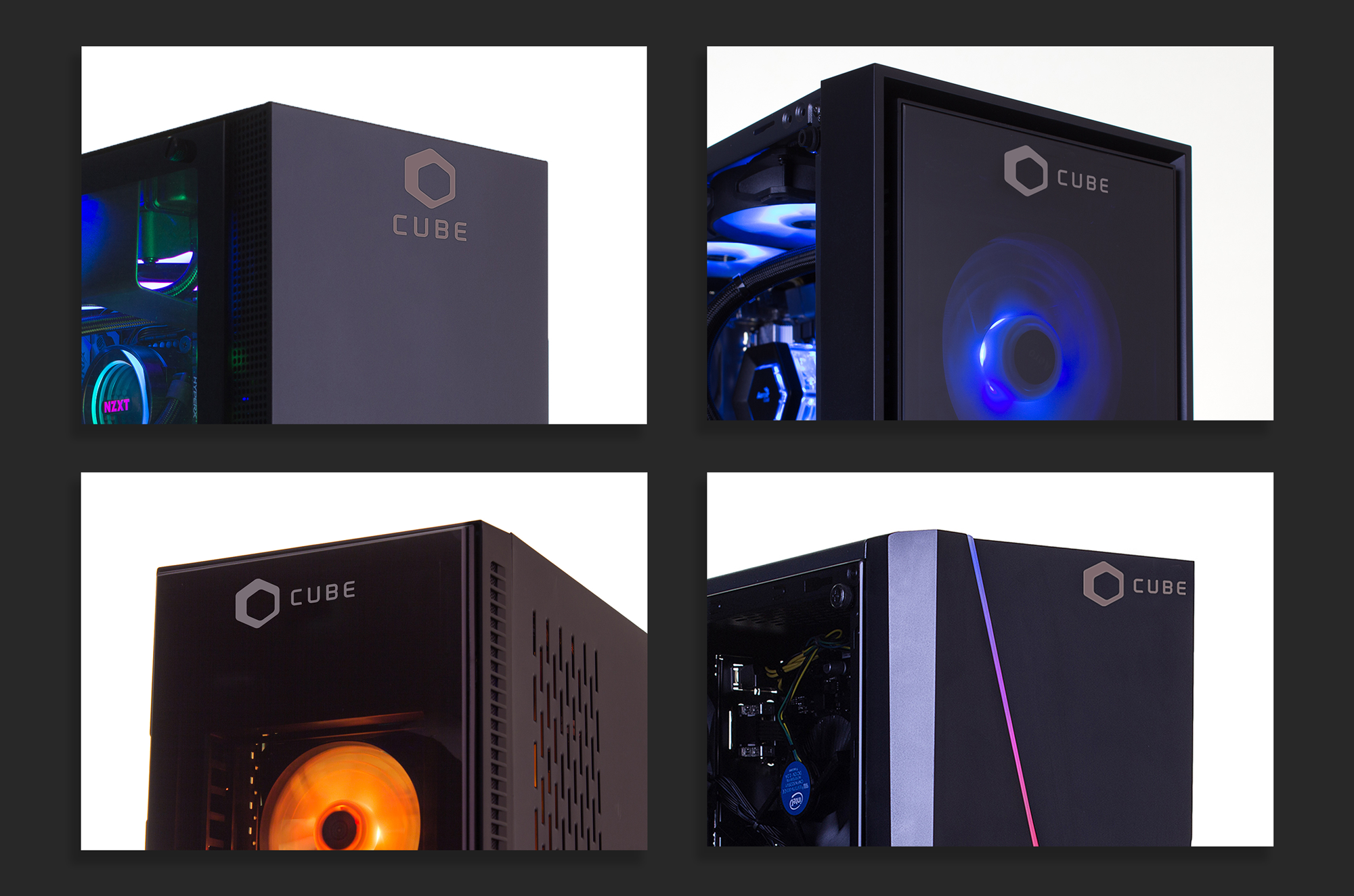
Cube Product Label
The logo was then converted to a metallic sticker label that was placed on all Cube PCs moving forward. Here are some examples of the different applications on various PC cases.
Cube Instruction Manual
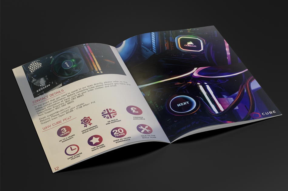
Here is the Cube Instruction manual. It included maintenance advice, tech support and more. I also designed some custom items to be used inside the manual.
Cube Stationary
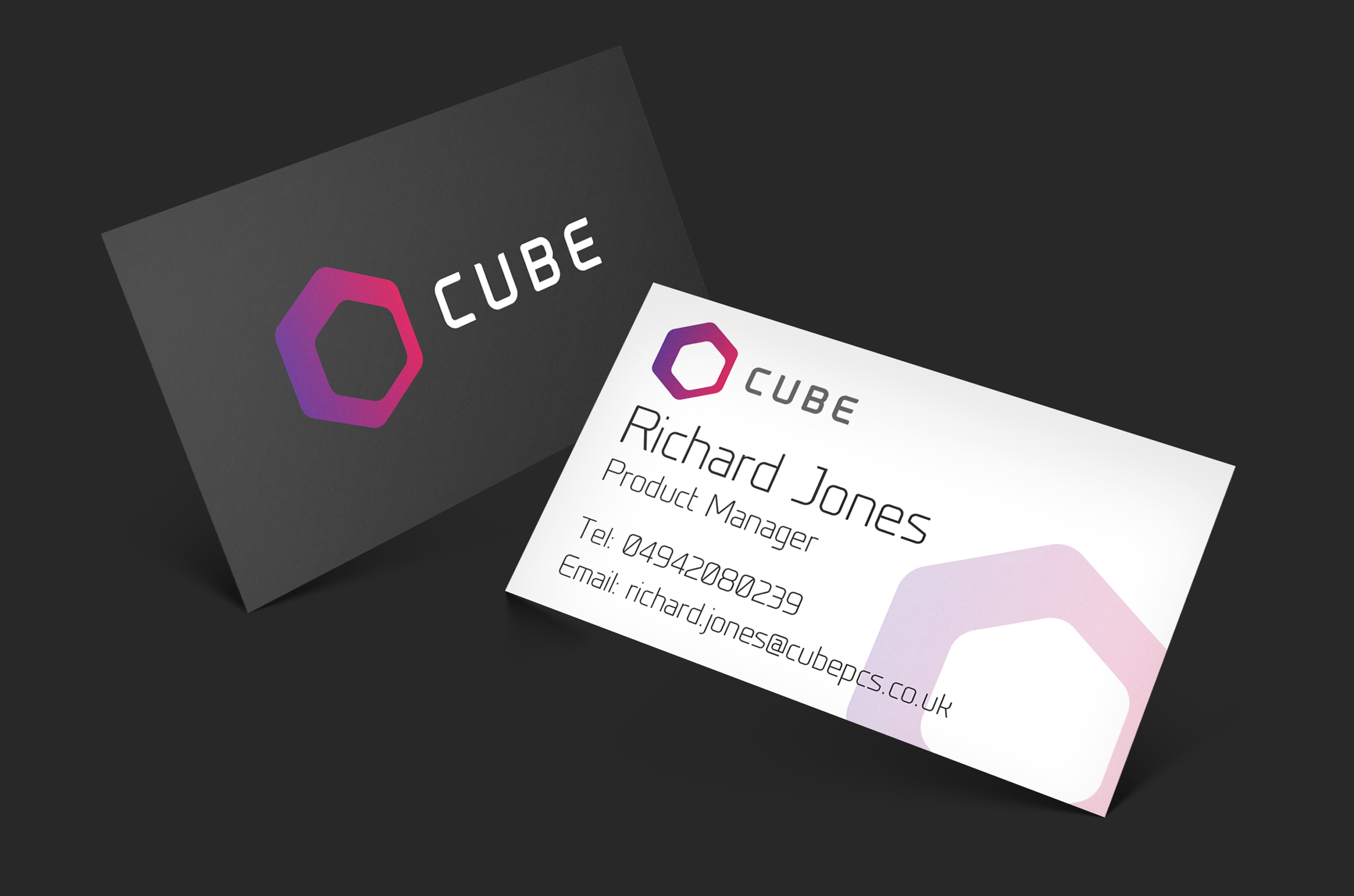
I also created the new Cube Stationary that included business cards and more. These business cards were to be handed out at events and in store by the Cube staff members.
Cube PCs Poster Advert
Concept
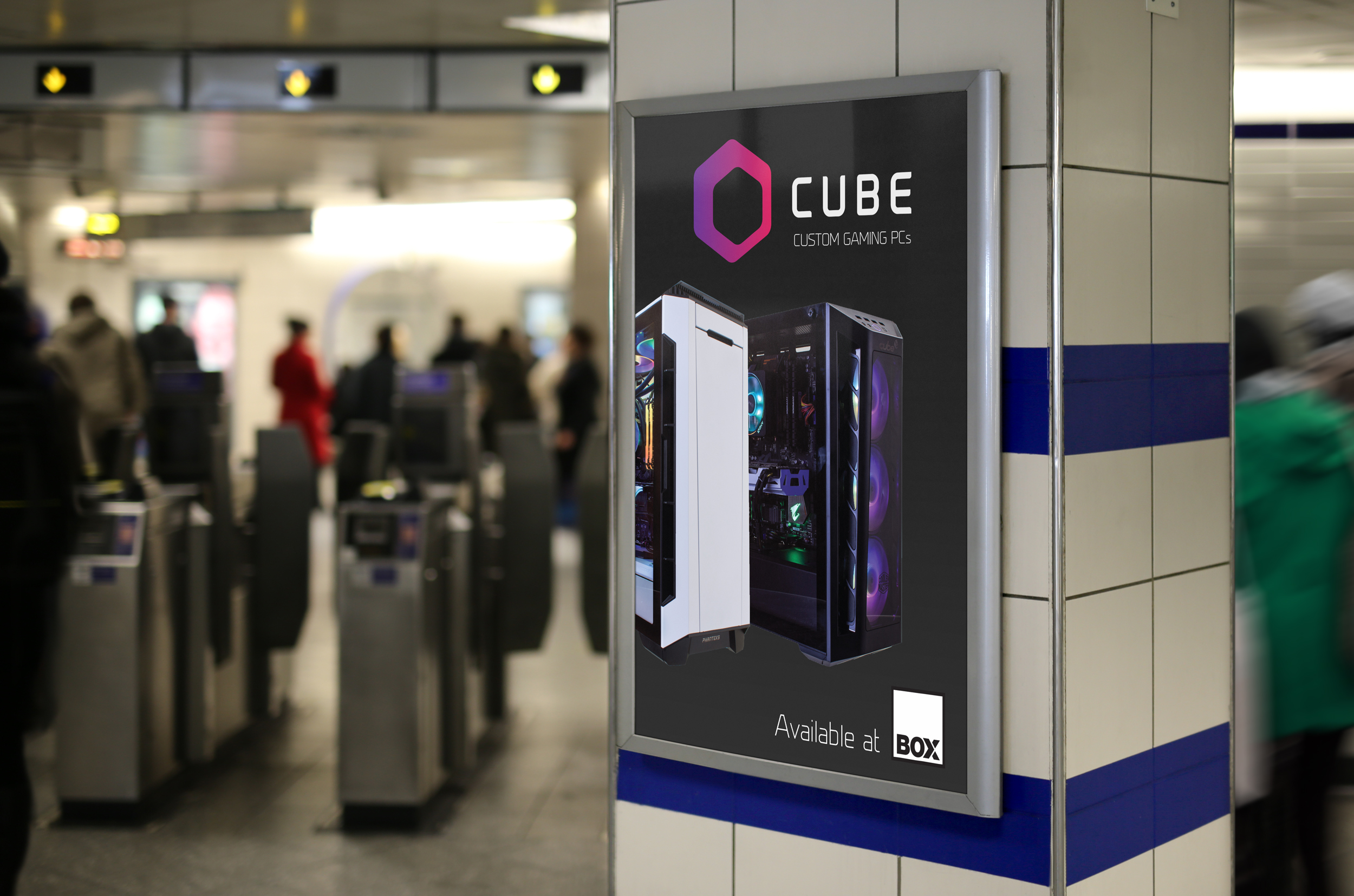
Above is a one of the concept ideas in the development phase for a poster advertisement for Cube PCs.