Clive Henry Group
Print / Digital / Videography
Clive Henry Group are a group of companies that work within the healthcare sector to help provide the highest quality tailored services through processes, people and technology. It consist of 4 different companies including Woodrow Mercer Healthcare, Mprove, Tech Canal and Cre8.
Mprove Blackpool Case Study Video
The Highlights video for Mprove is a condensed version of the full visual case study detailing the processes implemented to improve ambulance handover. It includes what steps were taken and how they improved the process. I edited this short cut version from the full video which was approx 50 mins.

Mprove Trifold Brochure
Above is a A4 Trifold brochure I designed for Mprove. The purpose of this brochure was to highlight the key benefits of collaborating with Mprove. Included in the document is a case study which shows the results of the improvements that were implemented by Mprove, to help patient flow.
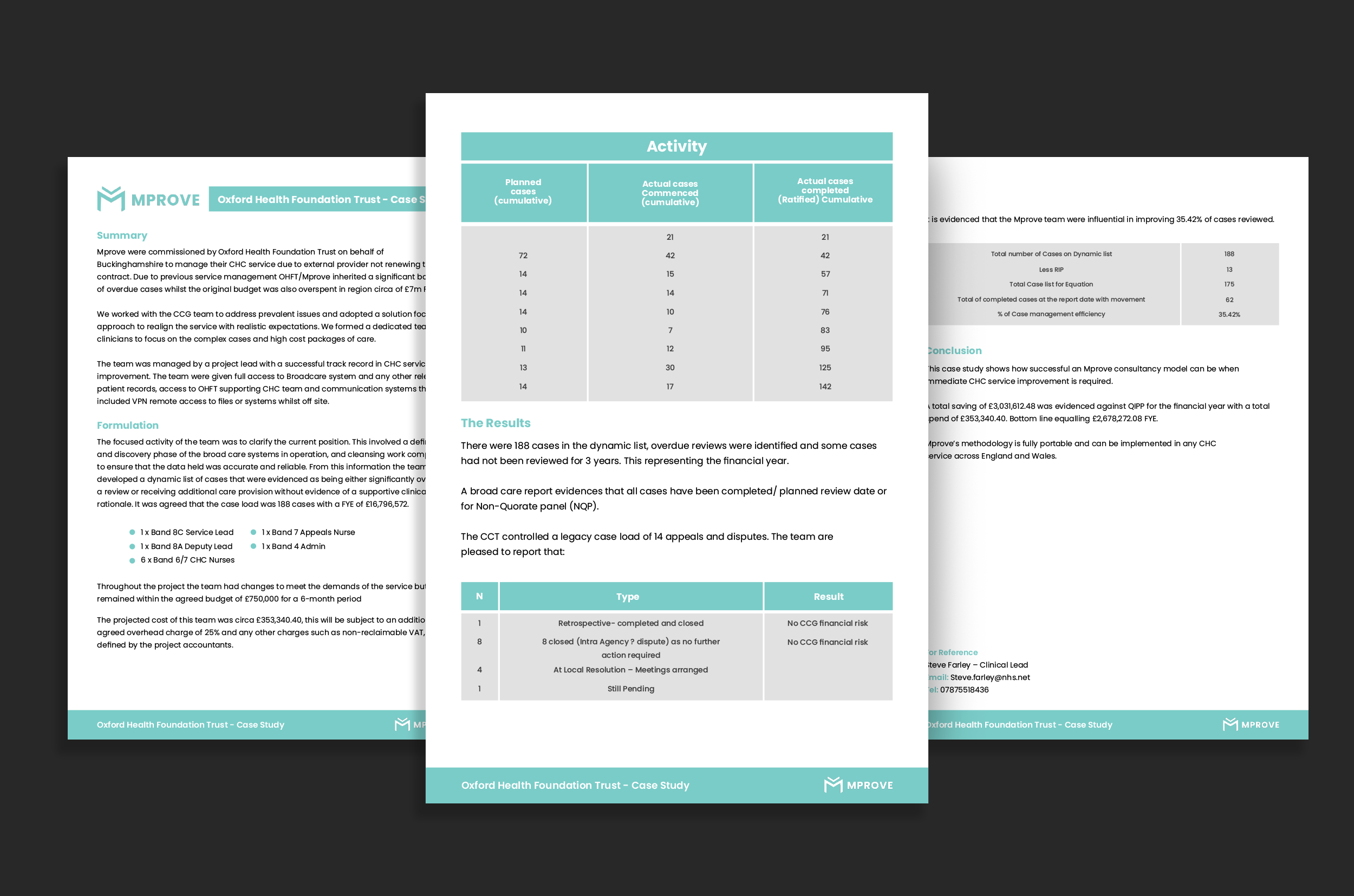
Mprove Oxford Case Study Document
Here is a written case study I designed for Mprove. I was given the copy and data as a text document to digest and to recreate as a functional, visually appealing document. I did this by using the main brand colours as accents throughout to highlight key pieces of data.
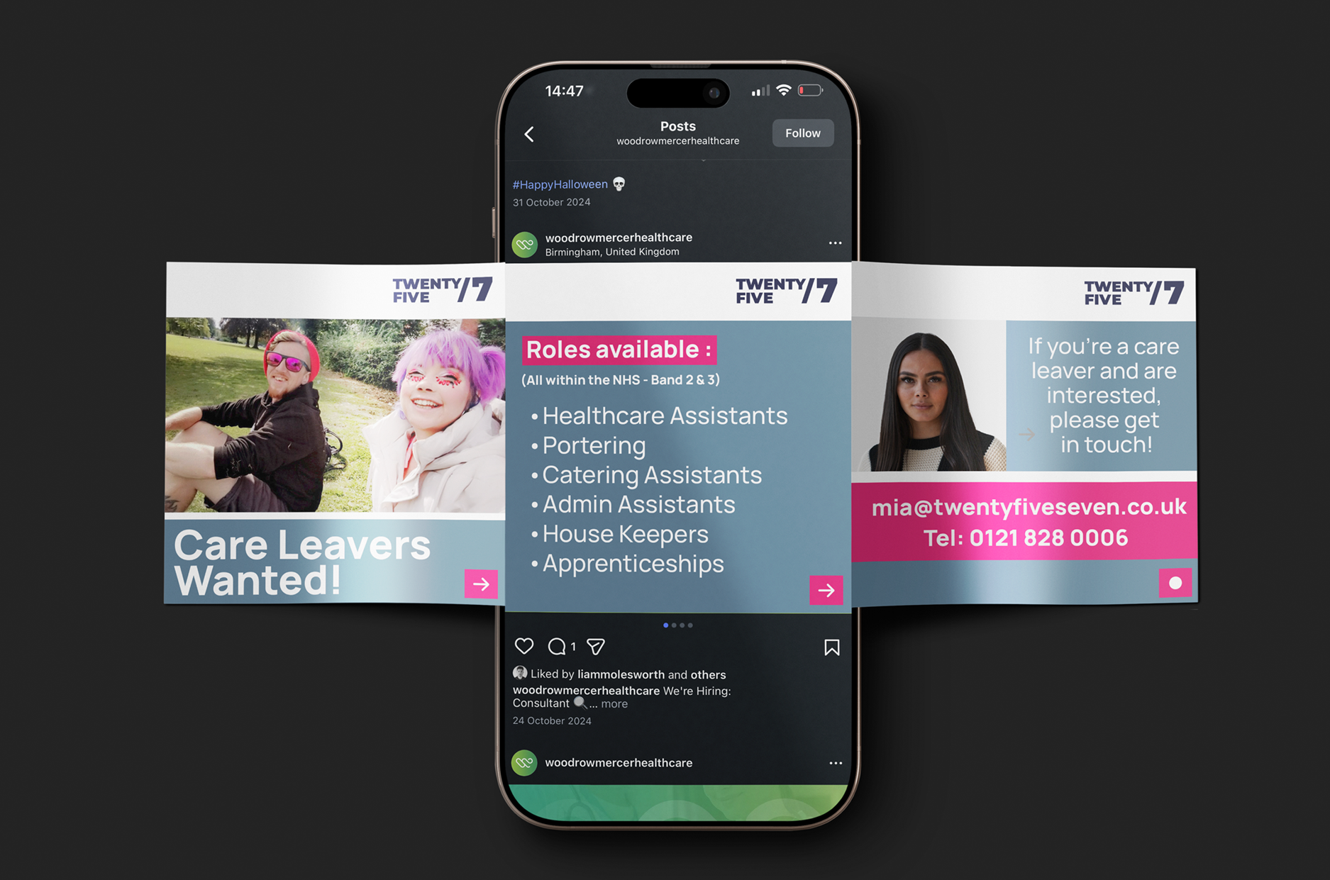
Twenty Five 7 Social Carousel Graphics
Above is a set of carousel graphics created for one of our clients, Twenty Five 7, promoting job roles for young care leavers including healthcare assistants, admin assistants and more.
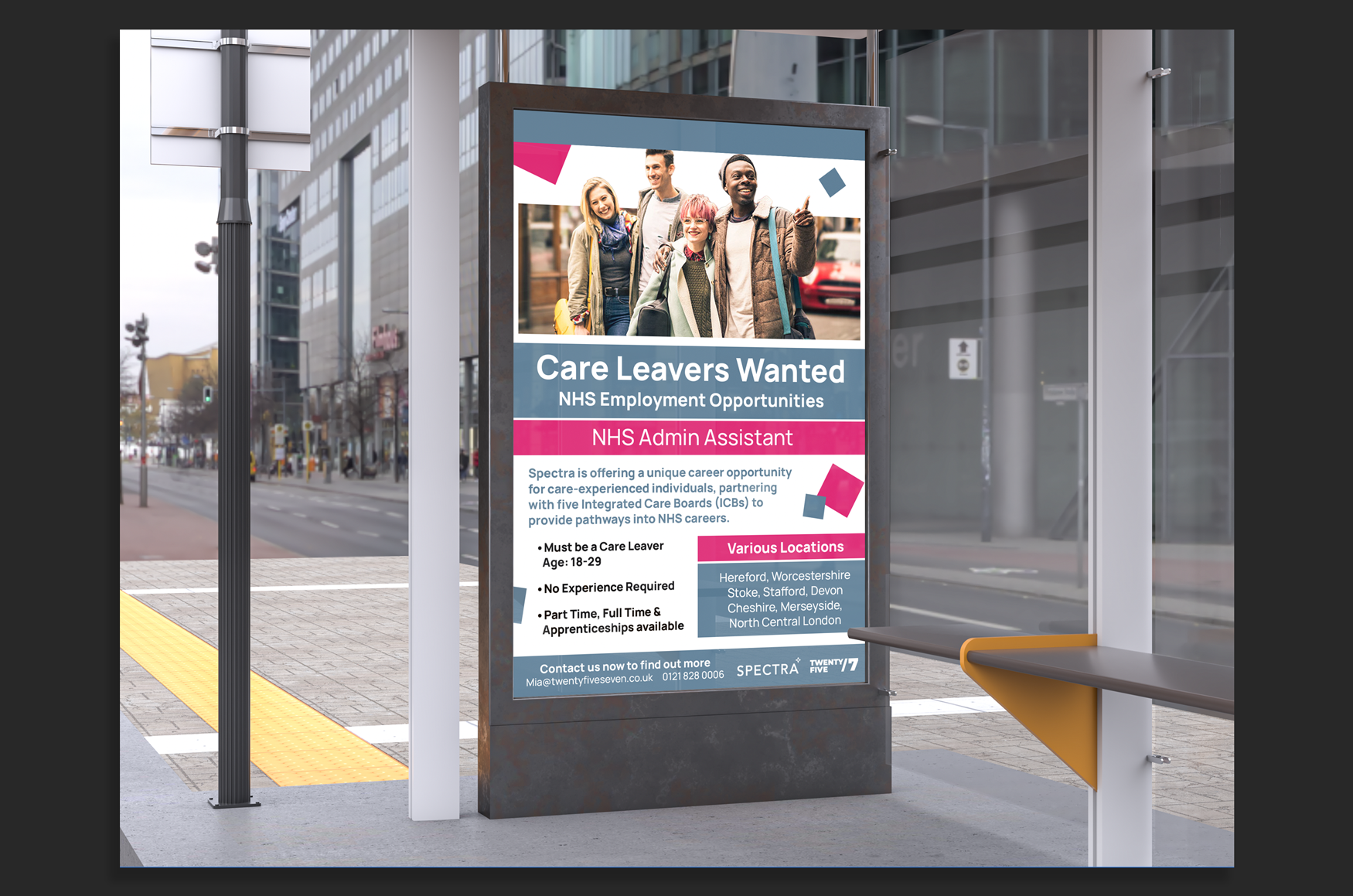
Twenty Five 7 Recruitment Poster
Based on the previous designs for the social graphics, I then went ahead and created a large scale poster for the same job roles, which required me to expand on the information and update the layout.

Woodrow Mercer Jobs Post Carousel Graphics
Above are a set of graphics I designed for a job posting for Woodrow Mercer. These graphics were designed to be used as ‘carousel’ style post across their social media platforms.
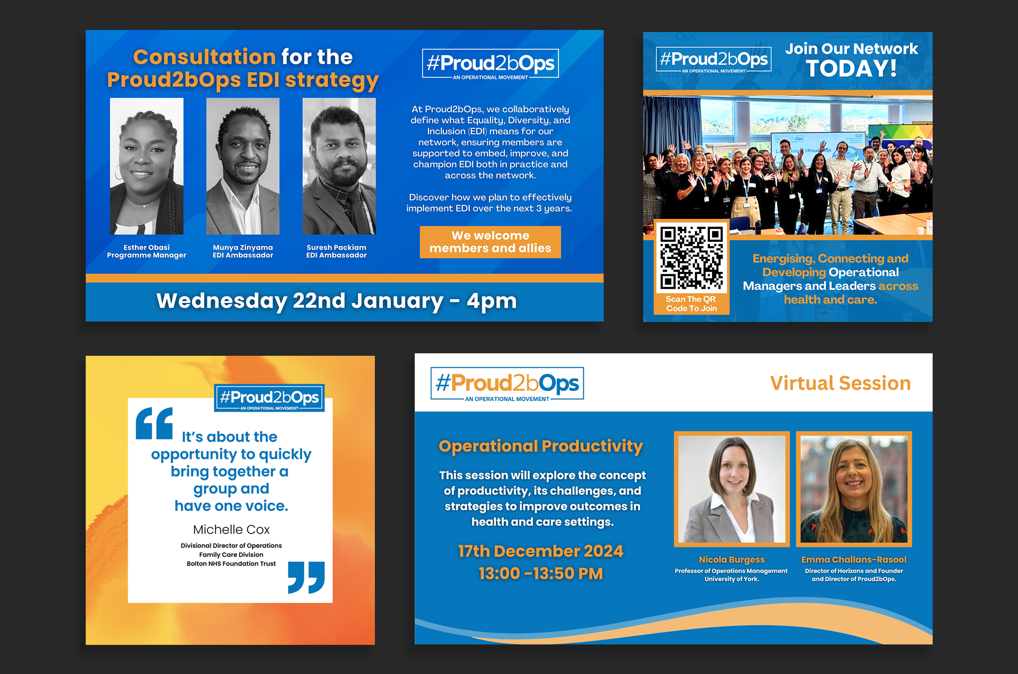
Proud2bOps Social Assets
Here are some of the social assets that I created for one of our clients, Proud2bOps. They include event announcement graphics, testimonials, general promo graphics and more.

My Care Banking Information Document
Here is a document I created for My Care Banking on behalf of Cre8. I was tasked with reinterpreting the data given to me into something that could be easily understood by the reader. I did this by creating icons for key statitics that could be easily recognised, and creating table data that could be read effectively at a glance.
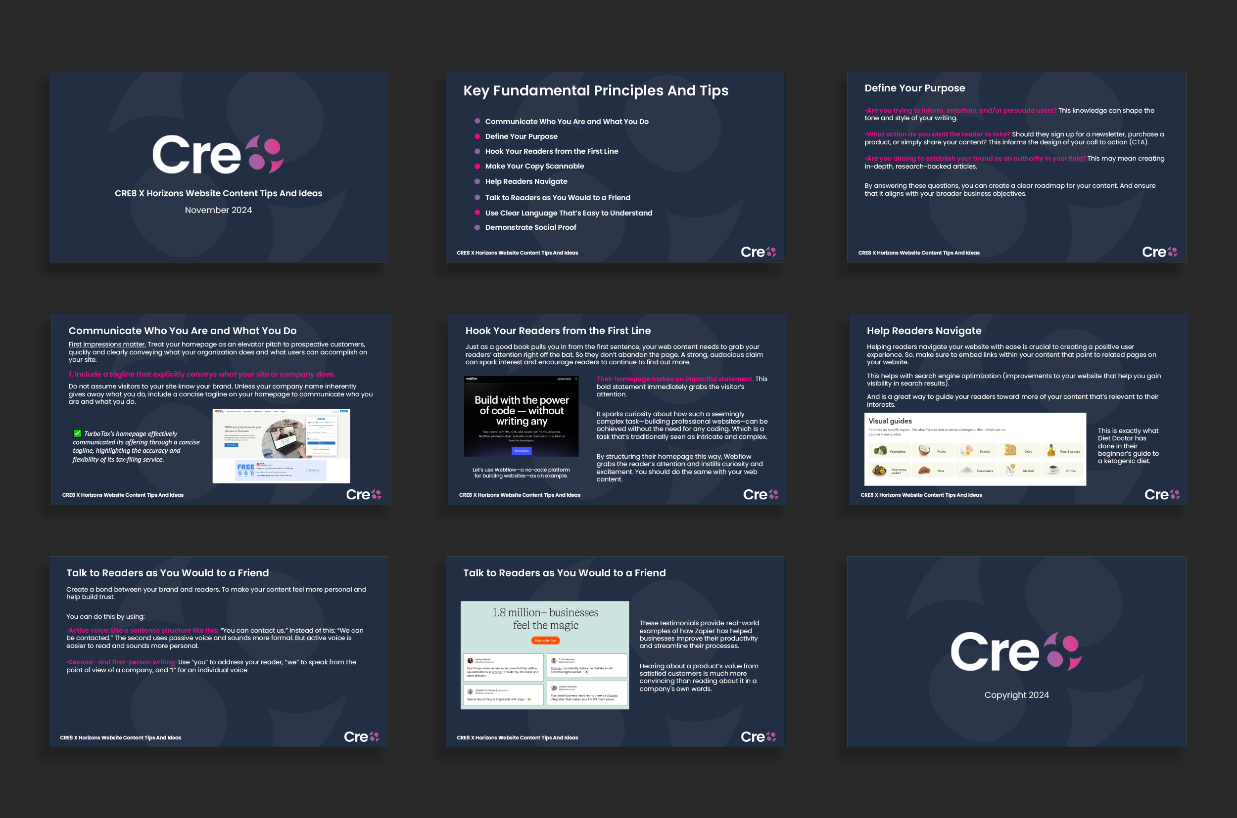
Cre8 Website Tips Presentation
This was a presentation I designed for one of our clients, NHS Horizons, which contained some tips and advice on how to approach a website redesign and how to effectively display content such as using icons and specific tone of voice.

Era Systems Bifold Brochure
Here is a brochure that I designed for one of our clients, ERA Systems. It highlights their services and the three key areas that they focus on to support enhanced teamwork and communication in a healthcare setting.